UI Component Library Builder
CautionBuild and document reusable UI component libraries with Storybook, accessibility testing, design token integration, and multi-framework exports.
$ Copy the SKILL.md file to .claude/skills/ui-component-library.md About This Skill
UI Component Library Builder generates production-quality React component libraries with documentation, testing, and accessibility baked in from the start.
Component Architecture
Uses the compound component pattern for complex widgets (Select, Tabs, Accordion), forwardRef for ref forwarding, and polymorphic `as` prop for semantic HTML flexibility. Radix UI primitives provide accessible base behavior that components style on top of.
Storybook Integration
- Generates CSF3 story files with:
- Default story showing the primary use case
- Variant stories for each visual state
- ArgTypes for interactive prop controls
- `play` functions for interaction testing with Storybook Test
- `docs` autodoc page with JSDoc prop descriptions
Accessibility
Each component follows WAI-ARIA patterns: focus management, keyboard interaction (arrow keys, Enter, Escape, Tab), live region announcements, and high-contrast mode support. axe-core accessibility tests run in Storybook and CI.
Testing
Vitest + Testing Library tests cover: render output, keyboard interactions, ARIA attribute correctness, and ref forwarding. Visual regression via Storybook's Chromatic integration.
Design Token Integration
Components consume CSS custom properties from the token system, making them automatically responsive to theme changes. Variants are expressed as data attributes, not class arrays.
Use Cases
- Building a React component library with Storybook documentation and CSF3 stories
- Creating accessible form components with ARIA patterns and keyboard navigation
- Generating Vitest component tests with Testing Library alongside each component
- Setting up Radix UI primitive composition for headless component architecture
Pros & Cons
Pros
- +Radix UI base ensures WCAG compliance without custom ARIA implementation
- +Storybook stories serve as living documentation and interaction test harness
- +Compound component pattern keeps API surface minimal and flexible
- +CSS custom property theming works across React, Vue, and web components
Cons
- -Radix UI dependency adds to bundle size for simple use cases
- -Storybook setup requires additional devDependencies and config files
Related AI Tools
Cursor
AI-native code editor with deep multi-model integration and agentic coding
- AI-native Cmd+K inline editing and generation
- Composer Agent for autonomous multi-file changes
- Full codebase indexing and context awareness
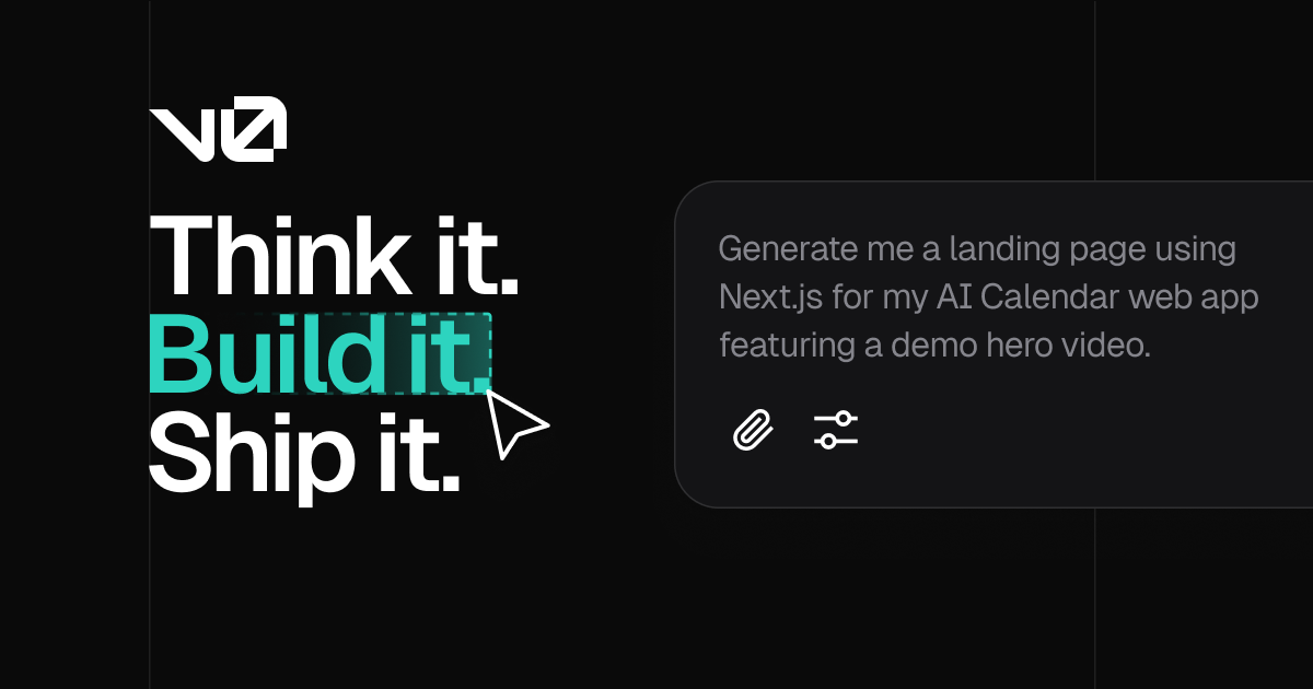
v0 by Vercel
AI UI generator that creates production-ready React components from prompts
- Production-ready React/Next.js component generation
- shadcn/ui and Tailwind CSS output
- Image and screenshot to code conversion
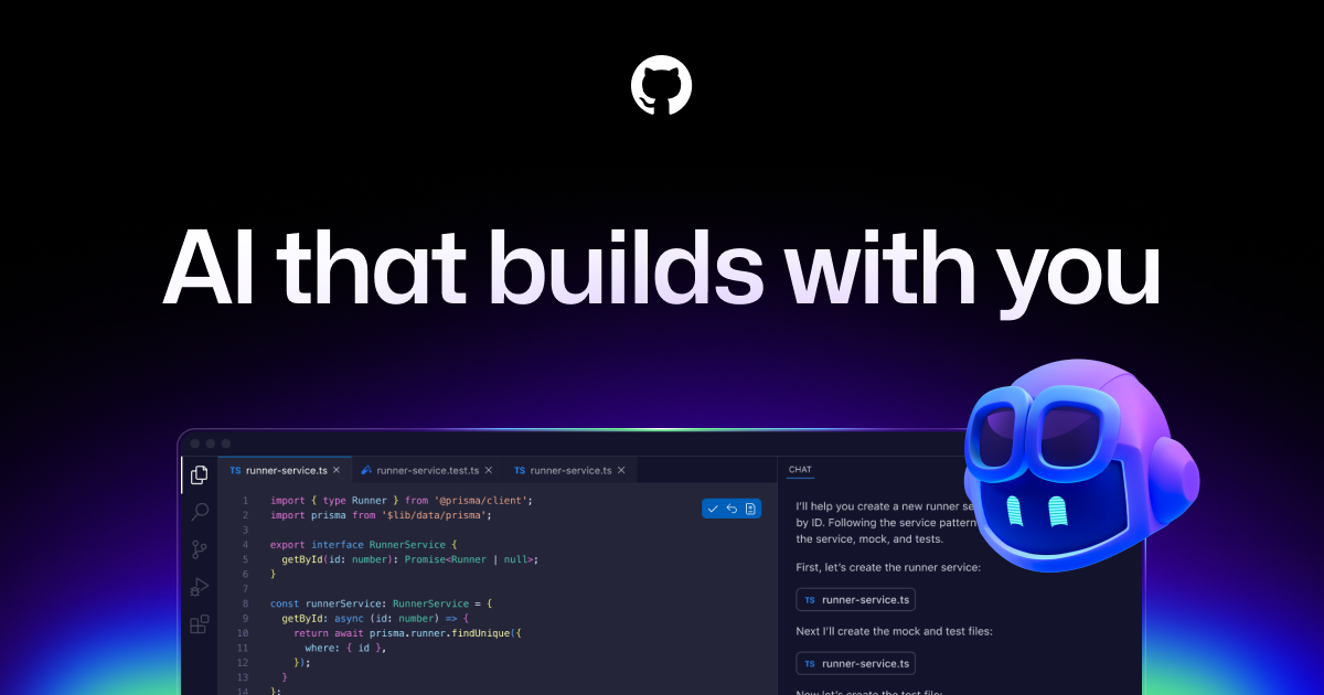
GitHub Copilot
AI pair programmer that suggests code in real time across your IDE
- Real-time code completions across 30+ languages
- Copilot Chat for natural language code Q&A
- Pull request description and summary generation
Related Skills
Design System Builder
Sets up design token systems, component libraries, and style guides with consistent theming, spacing scales, and typography hierarchies.
React Component Generator
Generate React components following best practices with proper typing, accessibility, testing, and Storybook stories.
Theme Generator
Generate multi-mode design tokens and theme configurations for light/dark modes, brand palettes, and CSS custom properties compatible with any design system.
FAQ
What does UI Component Library Builder do?
What platforms support UI Component Library Builder?
What are the use cases for UI Component Library Builder?
What tools work with UI Component Library Builder?
100+ free AI tools
Writing, PDF, image, and developer tools — all in your browser.
Next Step
Use the skill detail page to evaluate fit and install steps. For a direct browser workflow, move into a focused tool route instead of staying in broader support surfaces.